Table of Contents
Introduction
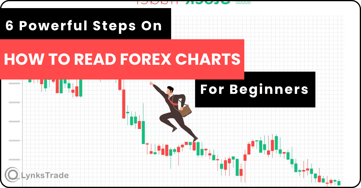
If you want to become a successful trader, learning how to read forex charts for beginners is one of the most important skills you must develop.
Imagine a doctor trying to perform surgery without prior knowledge of the tools to use. The result would definitely be a disaster.
Forex charts are the visual language of the market. Without understanding them, you are basically trading blindly. Every price movement, every trend, and every opportunity is shown clearly on a chart.
Many beginners feel intimidated when they first see forex charts. They look complicated, full of moving candles and lines. This reminds me of when I first started trading. I was so confused that I had to take a break for months, doubting whether I would ever understand it.
But in reality, once you understand the basics, it becomes very simple to read and analyze.
In this guide, I will break down forex charts explained in the simplest way possible so that even if you are a complete beginner, you can understand the market without struggling or feeling overwhelmed.
Before continuing, make sure you already understand basic forex terms for beginners, because we will be using some of them here. If not, read this 7 Proven Forex Terms Every Beginner Must Understand (No Confusion)
What Is a Forex Chart
A forex chart is a graphical representation of price movement over time.
Instead of looking at numbers alone, charts help you visually see:
- Where price started
- Where price is currently
- How price has moved over time
- Whether buyers or sellers are in control
In simple terms, a forex chart shows the story of the market.
Every candle or line you see represents the battle between buyers and sellers.
This is the foundation of forex chart basics.
Why Forex Charts Are Important
I like using the physical market as an example. When you go to the market to buy goods, you choose products that can give you profit when you resell them. Forex works in a similar way.
The chart is important because:
- It helps you identify trends
- It shows entry and exit points
- It helps you avoid emotional trading
- It allows you to analyze market behavior
Without charts, trading becomes guesswork.
Professional traders rely heavily on charts because they provide real time information about what is happening in the market.
Types of Forex Charts
There are three main types of forex charts every beginner should know. These are what you see immediately when you open TradingView or MetaTrader, which are charting tools used for analysis.
Line Chart
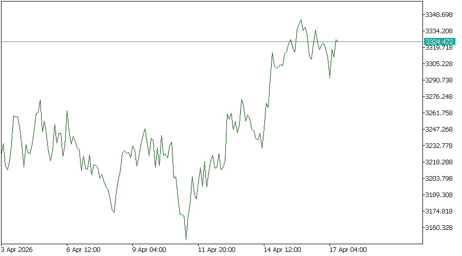
The line chart is the simplest type of chart.
It connects closing prices over a period of time using a single line.
Features
- Very easy to understand
- Shows overall market direction
- Not very detailed
I often use this to mark key levels. You will understand this better as you continue learning.
Example
If EUR USD closes higher every day, the line will move upward.
However, it does not show detailed price movement inside the candle, which makes it limited for serious trading.
Bar Chart
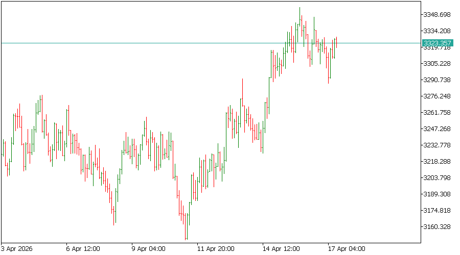
The bar chart provides more information than a line chart.
Each bar shows:
- Opening price
- Closing price
- Highest price
- Lowest price
Features
- More detailed than line chart
- Shows price range
- Can be confusing for beginners
Bar charts are useful, but they are not widely used today compared to candlestick charts.
Candlestick Chart (Most Important)
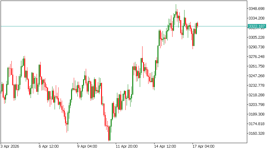
Candlestick charts are the most popular and widely used charts in forex trading.
If you want to understand how to read candlestick charts, this is where you should focus.
Each candlestick represents price movement within a specific time period.
A candlestick shows:
- Open price
- Close price
- High price
- Low price
Understanding Candlesticks
Each candlestick tells a story about market behavior.
Bullish Candle
A bullish candle means price moved upward. Buyers are stronger when price closes higher than it opened.
It is usually green in color by default and shows upward momentum in the market.
Bearish Candle
A bearish candle means price moved downward. Sellers are stronger when price closes lower than it opened.
It is usually red in color by default and shows downward pressure in the market.
Understanding Timeframes in Forex
A timeframe in forex refers to the period of time each candle on the chart represents. In simple terms, it shows how long it takes for one candle to form.
For example:
On a 1 minute timeframe, each candle represents 1 minute of price movement.
On a 1 hour timeframe, each candle represents 1 hour of market activity.
Different types of timeframes:
Short term timeframes such as M1, M5, and M15 are used for fast trading and show quick price movements but contain more market noise.
Medium term timeframes such as M30, H1, and H4 are the most commonly used by traders because they provide a clearer view of market direction and trends.
Long term timeframes such as Daily, Weekly, and Monthly show the overall market direction and are used for long term analysis.
Understanding timeframes is important because they help traders decide market direction, entry timing, and trade duration. Most professional traders use multiple timeframes together to get more accurate trading decisions. Now lets proceed to the main business which is how to read your Charts.
How to Read Forex Charts Step by Step
Now let’s simplify everything into a practical process.
Step 1: Identify the Chart Type
Always use candlestick charts because they give the most useful information.
Step 2: Identify Your Preferred Timeframe
Before analyzing the market, you must choose your preferred timeframe based on your trading style. The timeframe you choose will determine how long you stay in the market and how long you hold your trades.
Step 3: Look at the Market Direction
Ask yourself:
- Is price going up (uptrend)
- Is price going down (downtrend)
- Or is price moving sideways with no clear direction (ranging)
This is called identifying the trend.
Step 4: Understand Candlestick Behavior
Look at the candles:
- More green candles mean buyers are in control
- More red candles mean sellers are in control
This helps you understand market pressure.
Step 5: Identify Market Structure
Market structure simply means how price is moving.
Uptrend means price is making higher highs and higher lows
Downtrend means price is making lower highs and lower lows
Sideways market means price moves within a range without a clear direction
To understand more on market structure check out: https://www.investopedia.com/articles/technical/112601.asp
Step 6: Combine Information
Now combine everything:
- Chart type
- Trend direction
- Candlestick behavior
- Market structure
This gives you a full understanding of what the market is doing and helps you make better trading decisions.
Common Mistakes Beginners Make
Many beginners fail because they:
- Overload charts with indicators
- Ignore trend direction
- Enter trades too quickly
- Do not understand candlestick behavior
Keep things simple. The chart itself is enough to guide you.
Professional traders focus on:
- Price action
- Trend direction
- Simple candlestick reading
Simplicity is what works.
Quick Assessment
Let assume you open the chart:
- You see mostly green candles
- The market is moving upward
This means buyers are in control and the market is in an uptrend. Yes/No
As a beginner, if your answer is YES, now you are beyond the majority and can already start making better trading decisions.
What You Should Learn Next
Now that you understand how to read forex charts for beginners, the next step is learning candlestick patterns.
Candlestick patterns will help you understand potential reversals and trade setups.
Conclusion
Forex charts are not as complicated as they look.
Once you understand the basics of candlesticks, trends, timeframes, and market structure, you will start seeing the market more clearly.
Take your time, practice regularly, and focus on understanding price movement instead of memorizing indicators.
Leave a Reply